Tag: Dive Deep

Not All Who Wander

Not All Who Wander

There’s a danger in over-indexing on successful outcomes when evaluating a decision. As a LeBron fan I respect making the right play even if the shot doesn’t go down. When watching football (I hear there’s a game today?) I shake my head at coaches who punt when the data says taking a bigger risk is worth it. The same is true when making business decisions and evaluating technical tradeoffs.

Simple math makes the above obvious in certain cases. Whether a decision has a 90%, 60%, or even 51% probability of success, it is the right decision to make, even if it doesn’t work out (presuming the cost of failure is equal no matter what decision is made).

Of course a nice probability cannot be known in most real-world situations. It’s in those moments when it’s especially important not to focus too much on the outcome. Because a failed result doesn’t tell us anything certain about the original likelihood of success, as even 95% certainty fails 5% of the time.

I don’t say any of this to mean that a pattern of failed outcomes should be ignored, but that full context should be used in any process that attempts to evaluate the road that led to certain results.

Buckle Up

Buckle Up

There’s nothing like an effort to make sure all my years of accumulated data is backed up to kick up some nostalgia (not to mention an impending birthday). I doubt anyone else much cares, but this is my website and I’ll fill it up with digital relics from my past if I want to. Consider this fair warning.

We’ll get things started with this beauty, which I wrote September 24, 1992, if the file’s timestamp can be believed. Over 31 years old, it’s the oldest digital document I can find that I wrote myself.

I do not like to go to school. All the teachers do is teach you things you already were taught in 5th grade. That is, except for math and computer class. In math, we learn all about neat things, like 3y2+4(2x3+4). Mr. Farley is a great teacher, and the other teachers should teach like he does.

In computer class we learn about computers, such as this one, and about different computer programs. That is really neat for me because I enjoy working with computers, although some kids are really dumb when it comes to computers. But it is not like English, which is the same every single year. BORING!!!!!

I suppose that Science is O.K. Mr. Freese is pretty cool, and we learn some new stuff, and some old stuff. Like the scientific method. We learned it in 7th grade, and we learn it again now. It doesn’t make any sense.

This is my story about school. I hope that someday teachers will be able to read this and learn from it. Although they won’t listen to the small ideas from a thirteen year old boy, maybe they might get ideas anyway.

For the tech nerds, the file was in WordPerfect format (which definitely squares with the technology I was using in 8th grade), and opened perfectly on my Mac using LibreOffice.

More to come!

Resolution Recap

Resolution Recap

Relaxing on a much-needed holiday has given me time to wrap up a couple books, bringing this year’s reading to a close (I’ve also finally started Alexander Hamilton, but no way I’m finishing it on my return flight; it’s good but long).

Per my meta-resolution, I aimed to read 44 books this year. I’m finishing at 48, though a few only barely qualify. Here’s this year’s 5-star selections:

How did I do in my objective to read more non-male, non-white authors? The goal was 32 books, and I finished with 14 non-male, 15 non-white, and 4 both, for a total of 33. Mission accomplished? Quantitatively yes, but qualitatively, the mission of broadening horizons is never done; this will continue to be a focus area.

What will I aim for next year (besides the obligatory quantity)? For one, I intend to read more history and biographies. Given my job, I also am going to do more reading on politics and government. Should be fun!

Know Thyself

Know Thyself

It’s inevitable that over time I’m going to repeat myself here (including post titles). When I’m aware of potential similarities, I try to embed links back to those prior posts. A while back I noted an idea of building a thematic map of all my posts, but I wasn’t sure how to go about doing so. Now that I’ve learned some about embeddings, it was time to try my hand at it.

You can find the code I wrote to accomplish all of this on GitHub. I was inspired by the clustering section of the OpenAI cookbook, but took considerable liberties rewriting the code there, as I’m not a huge fan of typical data science code examples (they’re suitable for notebooks, perhaps, but rarely include meaningful names or breakdown into logical functions).

First, I had to actually fetch all the post content. I briefly toyed with the WordPress REST API, but couldn’t figure out how to enable it. No worries, though, RSS to the rescue! Unfortunately it’s XML, and I fiddled a bit with using lxml to parse the it, but stumbled upon feedparser which abstracted the details. Awesome!

Since it’s the de facto standard for Python data science, I loaded the posts into a pandas DataFrame. I’m still working on my fluency with pandas, numpy, scikit, and matlibplot, amongst other common tools, and I’m grateful for any opportunity to get their power under my fingers.

To compute embeddings for each post, I used the OpenAI API with the text-embedding-ada-002 model. It’s not good to store API keys in code; for local scripts I store all mine in the MacOS keychain using keyring. Nice and easy.

Since OpenAI usage costs money, I don’t want to repeatedly call the API with identical inputs if I don’t have to. That’s where cachier comes in (a library I help maintain) so results can be transparently saved to disk for subsequent use.

Once I had the embeddings, I used K-means clustering to group posts into common themes, and then t-SNE to reduce the dimensionality and produce a visualization of the clusters. To produce a summary of the theme of each cluster I took a sample of posts from each and shoved them into GPT4.

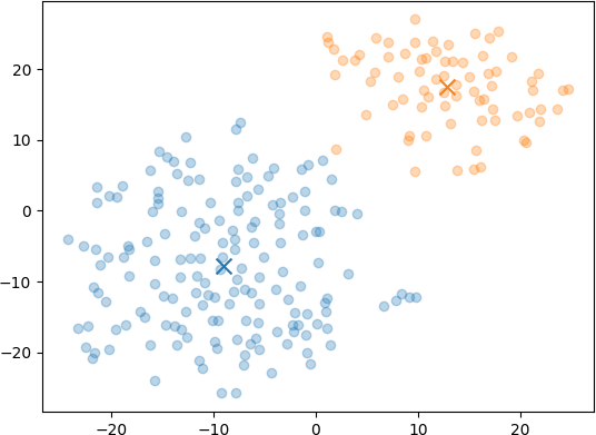
To start I tried using 2 clusters, which produced the following distribution:

Pretty interesting that there’s a natural grouping going on. Here’s the themes and sample posts:

Blue Posts

The theme of these posts is the author’s personal and professional experiences with technology, education, open-source contributions, ethical considerations, and the impact of travel and diversity on personal growth and the tech industry.

Orange Posts

The theme of these posts revolves around the reflections, experiences, and insights of a software developer navigating the challenges and nuances of the tech industry.

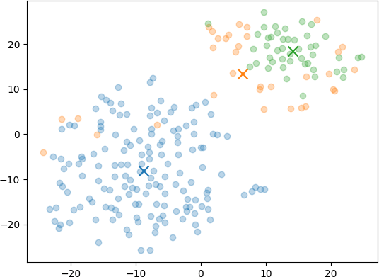
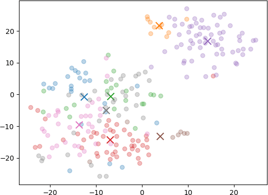
Of course I had to try with a variety of different numbers of clusters, so I reran with 3, 5, and 8 clusters as well (anyone see a pattern there?)

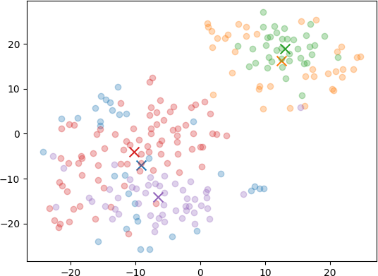
Of those graphs, to my eye the 5 cluster one seemed the best balance between having enough distinct themes without starting to look too arbitrary. Here’s the summarizations for it:

Blue Posts

The theme of these posts is the author’s personal and professional experiences, challenges, and insights related to technology, software development, and working within the tech industry.

Orange Posts

The theme of these posts revolves around the challenges, insights, and anecdotes from the world of software development and engineering management.

Green Posts

The theme of these posts is the multifaceted nature of software development, encompassing the importance of maintaining code quality, the broad skill set required for effective development, and the challenges and responsibilities that come with the profession.

Red Posts

The theme of these posts is the reflection on and sharing of personal experiences, insights, and best practices related to software development, including contributing to communities, understanding abstractions, effective communication, and professional growth within the tech industry.

Purple Posts

The theme of these posts is the author’s personal reflections on their experiences, interests, and philosophies related to their career, hobbies, and life choices.

What’s next? I’d like a quantitative way to evaluate the quality of the theme clustering and summaries produced. There’s a lot of non-determinism in the functions used here, and with some twiddling I bet I can produce improved results. I’ve got some ideas, but will save them for a future post.

Keep It Secret, Keep It Safe

Keep It Secret, Keep It Safe

AWS recently announced that blocking public access to published AMIs will be enabled by default. This is good news, as it’s an easy way to accidentally leak sensitive data. When I first started using GovCloud (2015 maybe?) I remember stumbling into a set of AMIs that, based on their names alone, clearly weren’t intended to be shared. Thankfully a quick note to AWS support and the offending party squared things away post haste, though I’ll never know if damage had already been done.

Horror stories are easily found online of the easiest way to make this mistake: turning on public access to an S3 bucket. Thankfully AWS has made taking this step difficult; in our internal accounts, in fact, without getting prior approval, creating a bucket with public access would get you a Sev-2 page in about 15 minutes. Unfun.

Which is why I found it so surprising to discover that in GCP, the only way I can tell to host a static website behind a CDN is to make the backing cloud storage bucket public. I mean, I recognize by definition it’s okay for the data to be Internet-accessible, but it meant turning off the “don’t allow public cloud storage” block project-wide, which seems a bad idea. Bad enough that the moment I hit that button I got a security warning via email. Am I missing something here? Would love to know if there’s a better way.

In any case, it’s going to be an adventure learning all these subtle differences as I broaden my cloud experience. Passing certifications is nice, but it’s no substitute for kicking the tires.

(Editor’s Note: I’m chuckling to myself as I add Amazon LP tags to a post that’s partly about GCP. Those things are burned into my brain forever).

If You Can’t Beat ‘Em

If You Can’t Beat ‘Em

I don’t have a ton of tech writers that I read regularly, but one that I do is Gergely Orosz. His newsletter, The Pragmatic Engineer, is incredible, full of insights and advice for folks at any point in their technical career journey.

A recent two-part installment discussed in detail the plusses and pitfalls of trying to measure developer productivity, a notoriously difficult problem in software engineering. It’s one I’ve been thinking quite a bit about recently, in an attempt to balance the business need to understand how much value we can deliver per dollar spent, without devolving into a joyless culture of mediocrity that treats its team like coding robots (which, it must be said, they’re not).

If you’re in the same position as me, I’d encourage you to subscribe to the newsletter and give the articles a read-through, but if you’re short on time, I absolutely love this simply-summarized single objective measure:

Weekly delivery of customer-appreciated value is the best accountability, the most aligned, the least distorting.

Yup, that sums it up. Other measures matter, but nothing beats screamingly happy stakeholders.

Amongst The Silos

Amongst The Silos

Steps I expected to take when creating an Amazon QuickSight instance and connecting it a PostgreSQL database in Amazon RDS:

  1. Write terraform to create the QuickSight instance
  2. Write terraform to create the RDS dataset
  3. Open the QuickSight console and create a dashboard using that dataset

Steps I actually had to take:

  1. Write terraform to create the QuickSight instance only to discover that creation via API is not supported in my region of choice, so had to throw it away
  2. Create the QuickSight instance manually in the console, during which I had to explicitly select that I wanted to give permissions to talk to RDS
  3. Manually edit the resultant IAM policies to include permissions to use the customer-managed keys that encrypt all our resources
  4. Apply a security group to the RDS instance that allows TCP access on port 5432 to the QuickSight public IP addresses in my chosen region
  5. Add a user to PostgreSQL specifically for QuickSight to use, one with a password hashed using an older algorithm, since the QuickSight driver uses a version that lacks support for modern (read: most secure) algorithms
  6. Grant permissions for this user to be able to read the schemas and tables that hold the data I want to visualize
  7. Create the RDS dataset in QuickSight, manually entering the connection details
  8. Create a dashboard using the above dataset

Figuring out a number of the above steps required decoding unhelpful errors, searching through pages of documentation, and other non-trivial efforts. For shame, Amazon, for shame. Y’all should talk to each other more.

Half The Battle

Half The Battle

Some things are just good to know, for example:

  • git
  • SQL
  • networking protocols (UDP, TCP, HTTP, SSH, DNS)
  • the relative speeds of various storage media (L1, L2 caches, RAM, and disk)
  • the airspeed velocity of an unladen European swallow

Add to that list OAuth2, the lingua franca of authentication. Get yourself acquainted with this helpful two-part series:

Show Me The Data

Show Me The Data

For Christmas back in 2020 my daughter got me a daily crossword puzzle calendar. That started a streak of completing a puzzle every day for two years. I tracked data on how fast I was able to complete each one, curious if I would get measurably better over time.

Today I finally sat down, put all the data into Excel, and crunched some numbers. Here’s a couple interesting results (interesting to me, at least):

Normally I aimed to complete a puzzle in about 15 minutes. For the most part my results clustered around that value, though my overall average across 623 puzzles was 15.9 minutes thanks to the occasional outliers in the 30-ish minute range. Fastest solve time was 6 minutes, which I accomplished 7 times.

This graph of rolling average (with a 30 day window) pretty clearly shows I got better over time as I suspected, going from a 20-ish minute average at start all the way down to 13-ish minute average towards the end. I’m happy with those results!

In total, I spent 165 hours working crosswords in 2021 and 2022, and while it’s not exactly the world’s most productive activity, there’s enough mental benefit that I don’t regret it.

Just No

Just No

Can we all agree that “drinking from a fire hose” is a terrible metaphor for the feeling of starting a new job? It’s overused, cliched, and kinda gross.

What I find most funny is that it’s usually stated as a humble brag about the amount of information you can ingest in short order, or to indicate that your new company is some kind of special unicorn doing work so incredibly complex that it overwhelms all who dare join it.

Reality is that the feeling of being overwhelmed in a new role is totally normal, even if the work is banal or the company is pedestrian. Sure, it takes time, but don’t make it sound harder than it is.